
In this exercise, you will learn how to analyze customer retention by categorizing customers as New or Returning based on their purchase history.
You will create calculated columns and measures to calculate total revenue by customer type and the retention rate. The analysis includes visuals like bar charts, cards, and line charts to compare revenue, display retention rates, and track monthly trends. This exercise is ideal for understanding customer behavior and improving retention strategies.
Tasks
- Load the dataset into Power BI and ensure relationships are established.
- Create the following calculated columns and measures:
- Calculated Columns:
- Add a column to classify customers as New or Returning based on their transaction history.
- Measures:
- Calculate the Total Revenue by Customer Type.
- Calculate the Retention Rate as the percentage of returning customers.
- Calculated Columns:
- Create the following visuals:
- A clustered column chart to compare Total Revenue for New vs. Returning customers.
- A card visual to display the Retention Rate (%).
- Add a line chart to display total revenue by monthly trends.
Solution:
Load the datasets below into Power BI:
1- Customers Dataset
| CustomerID | Customer Name | Join Date |
| 101 | Sandeep | 01-01-2024 |
| 102 | Alice | 01-02-2024 |
| 103 | Bob | 01-03-2024 |
| 104 | David | 01-04-2024 |
| 105 | Diana | 01-05-2024 |
2- Transactions Dataset
| TransactionID | Date | CustomerID | Revenue | Customer Type |
| 1 | 01-01-2024 | 101 | 500 | New |
| 2 | 01-02-2024 | 102 | 800 | New |
| 3 | 01-03-2024 | 101 | 600 | Returning |
| 4 | 01-04-2024 | 103 | 700 | New |
| 5 | 01-05-2024 | 104 | 400 | New |
| 6 | 01-06-2024 | 102 | 300 | Returning |
3- Date Table
Write the DAX code below to create a Date Table. Based on the minimum or maximum date from Transactions, we will create the Date Table.
Go to the Modeling tab > Click on New Table.

Date = CALENDAR(MIN(Transactions[Date]), MAX(Transactions[Date]))
Create a relationship between all tables:
Go to the Model View> and create a relationship between all tables.
Customers(CustomerID) > Transactions(CustomerID)
Transactions(Date)> Date(Date)

Create the following calculated columns and measures:
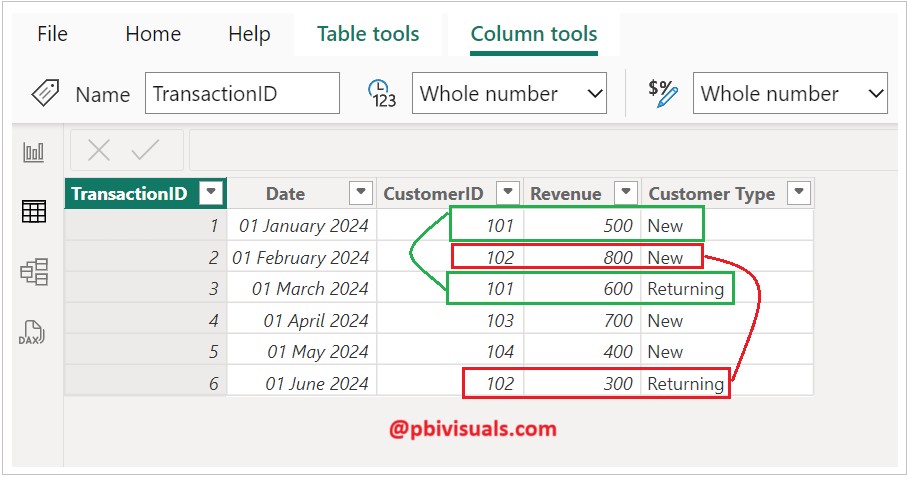
Add a column to classify customers as New or Returning based on their transaction history.
Right-click on the Transactions dataset and select New Column. And write the DAX code below.
Customer Type =
IF(
CALCULATE(
COUNTROWS(Transactions),
FILTER(
ALL(Transactions),
Transactions[CustomerID] = EARLIER(Transactions[CustomerID]) &&
Transactions[Date] < EARLIER(Transactions[Date]) ) ) > 0,
"Returning",
"New"
)
Explanation of the DAX Code:
- The formula checks whether the customer has any prior transactions in the dataset.
EARLIER(Transactions[Date])references the current row’s date to compare it with earlier transactions for the same customer.- If a prior transaction exists, the customer is classified as “Returning”, otherwise, they are classified as “New”.
Now, create two measures: Total Revenue and Retention Rate:
Right-click on the Transactions dataset and select New Measure. And write the DAX code below.
Total Revenue = SUM(Transactions[Revenue])
Retention Rate =
DIVIDE(
CALCULATE(
DISTINCTCOUNT(Transactions[CustomerID]),
Transactions[Customer Type] = "Returning"
),
DISTINCTCOUNT(Transactions[CustomerID]),
0
)
Create the following visuals:
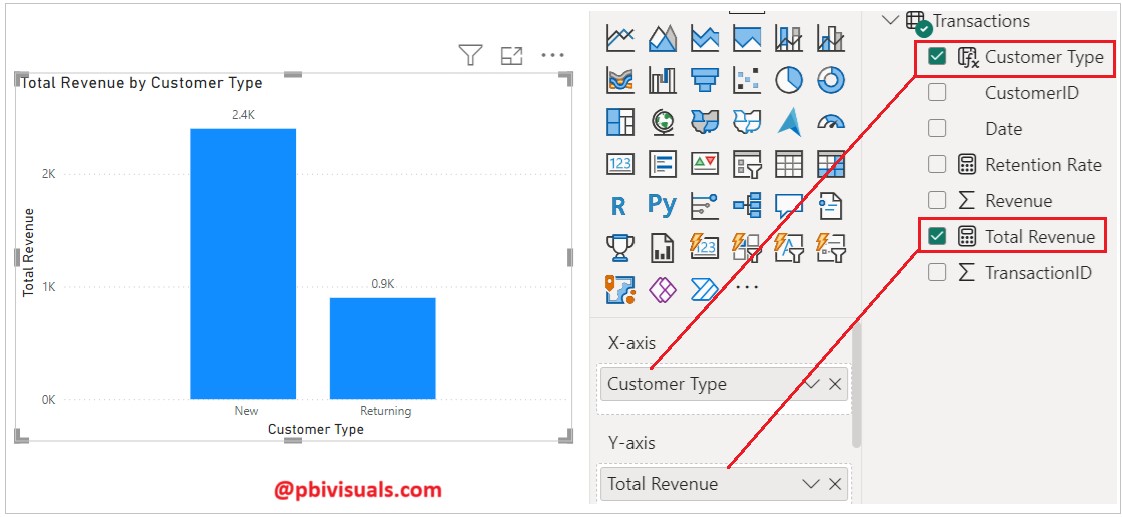
A clustered column chart to compare Total Revenue for New vs. Returning customers
Now, add a Clustered Column Chart to the report page. Set the X-axis to the Customer Type calculated column and the Y-axis to the Total Revenue DAX measure. Refer to the screenshot below for reference.
Now add a card visual to display the Retention Rate (%):
Add a card visual to the report page and add the Retention Rate measure. After that, select the measure, go to the Measure Tools tab, select Percentage under the Format section, and set the Decimal Places to 0.

Add a line chart to display total revenue by monthly trends:
Add a line chart to the report page and place the Year and Month from the Date table on the X-axis, and the Total Revenue measure on the Y-axis.

I hope you enjoyed the post. Your valuable feedback, questions, or comments about this post are always welcome.
![]()
Thank you for the exercises! 💫