
In this blog you will understand the detailed overview of components in Power Apps and custom properties of components.
Components are a reusable building blocks for a canvas app so that app maker can reuse it within the same app or across app using the component library.
Components are useful in building larger apps with similar control patterns. If you update a component definition inside the app, all instances of the app reflect your changes.
Components also reduce duplication of effort by eliminating the need to copy/paste controls and improve performance.
Things to be cover here-
- Component in Power Apps
- Input custom component property
- Output custom component property
Let’s understand why we need a component-
Suppose, you are working with multiple app screens, and want to display some common things like header text, footer text, company logo in each screen. So without components you would have to do the same thing for each screen separately.
Create a canvas component
Here you will see how to create a component for header, footer for canvas app.
Step-1: Go to the components tab> Click on +New component> rename the component.

Step-2: Set the header component height.

Step-3: Now set the width of component to App.Width, It will set component width as per app screen width size automatically.
Go to the component width property and set it to App.Width.

Step-4: After that Add below controls in canvas app and set the property accordingly
Rectangle – For background
Label 1: For heading, you can change the color, font size of the heading text through right side properties tab.
Label 2: Display logged in user name, set the label text property – “Welcome! “ & User().FullName
Image- Display logged In user photo, set image property- User().Image

Step-5: Add new component for footer, and follow the same steps.

Access the components in App screen
Open the Screen> Go to the Insert tab> Search component and tap it. After that drag the components to Top & bottom of canvas app.

Similarly you can access these components anywhere in the app.
Note: You cannot edit component text in screen, if you want to modify component text, go to component tab and change there and it will automatically change text everywhere.
Custom Input Output Properties in Components
The component can receive input or emit output using custom properties
Two types of custom properties are-
Input Property can receive values from the app, which the component can use internally.
Output Property can emit data or state from the component, which the app can use.
Understand Input custom property-
Suppose you have multiple screens and you want to have common header layout for all screens like header background, login person image and name but want to display different header text for all screen. So in this scenario you can use Input custom property in component.
Step-1: First, create a component with static details which you want to be common for all screens like some common text and name and image of the logged in person for that you can refer above steps 1 to 4.
Step-2: Now add one more label for dynamic header change.

Step-3: After that add custom Input Property.
Select HeaderComponent > Click on +New Custom Property > Give the display name> Select Property type Input> Check Raise Onresetwhen value changes > Create

Step-4: Now set the label property with Input component Property.
HeaderComponent.CustomHeader

Step-5: Select Screen > Go to the Insert Tab> Choose header component

Step-6: Now you can change header name for screen.

Step-6: Now open other screen > Add header component > and change header text.

Understand Output custom property-
Output property is used to send data from the custom property to the app. Let’s understand how output property works.
Step:1– Add New component and create two New custom property, one for Input & other for Output.
Input property-
Name- Component_Input, Data Type- Number, and check RaiseOnRest option.
Output property-
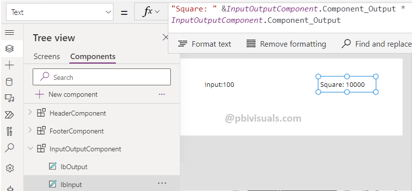
Name- Component_output, Data Type- Number

Step-2: Add two label in component screen, and set the property of both labels
Set Input Label Text Property- “Input:” & InputOutputComponent.Component_Input

Set Output Label Text Property-
“Square: ” &InputOutputComponent.Component_Output * InputOutputComponent.Component_Output
Note: Here you can write any calculation which you want to see as output, the above formula is to get the square of the number.
Step-3: Now Select Component > Choose Output component property> and bind InputComponent
InputOutputComponent.Component_Input

Step-4: Now open any Screen > Add InputOutputComponent through Insert tab > Add one Text Input box for Input.
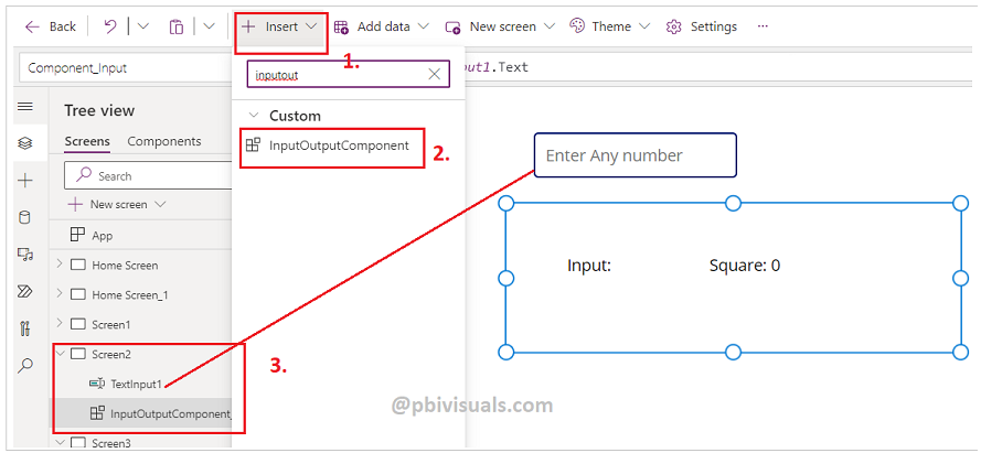
Step-5: Select Component > Choose Component_Input property and set it to TextInput1.Text.

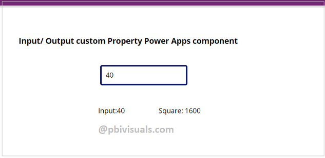
Step-6: See the result, enter any number to get the Square-
Refer more Power Apps post- Microsoft Power Apps
Hope you enjoyed the post. Your valuable feedback, question, or comments about this post are always welcome.