
A Clustered columns chart is useful to display comparison of multiple series as in vertical columns. Each data series shares the same axis labels, so vertical bars are grouped by category.
It is one of the simple and most commonly used chart types in data visualization fields.
Refer similar chart: Stacked Column Chart
Let’s get started-
Download Sample dataset- Global_superstore_2016.xls
Follow these steps in order to create a Clustered column chart:
Step-1: Import Orders dataset from Global superstore file.
Step-2: Add Clustered Column Chart visual into Power BI Report page from visualization pane.
Step-3: Select Clustered Column Chart & add some columns into chart.
- Axis: ‘Region’
- Legend: ‘Category’
- Value: ‘Sales’
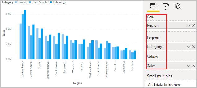
Required Fields descriptions:
- Axis: Specify the Column that represent the Vertical Bars.
- Legend: Display grouped by category data series as in Vertical Bars.
- Values: Any Numeric value such as Sales amount, Total Sales etc.
Format Clustered Column Chart visual
You can set the font size, font family, Title name, X axis, Y axis & Data labels colors for chart visual.
Click any where on chart then go to Format Section & set below properties-
- General: Allows you to set X axis & Y axis, width & height of column chart.
- X-Axis: Using this section allows you to modify the appearance of the X-Axis section of this chart.
- Y-Axis: Using this section allows you to modify the appearance of the Y-Axis section of this chart.
- Data colors: Here you can change the colors used for each series in the chart.
- Data labels: Its enable the values for each category on chart & you can set the display unit, position & orientation of labels.
- Zoom Slider: It enables zoom feature on chart, using this you can easily saw the small values on chart.
- Title: Specified the Title name for Chart.

Enable Zoom Slider for Clustered Column chart:
Zoom slider is a good way to examine a smaller range of the data in a chart without having to use a filter.
Click any where in chart > Go to Format section > Enable Zoom slider

Implement Small multiples feature- Small multiples chart
Refer more Power BI visuals- Power BI Visuals
Hope you enjoyed the post. Your valuable feedback, question, or comments about this post are always welcome.
![]()