
A Scatter charts, also known as Bubble chart, shows the relationship between two numerical values. You can also create a Data Storytelling with Scatter Chart.
Using two points of data we consider the chart a Scatter chart, when adding a third point of data then the chart will become a Bubble chart.
We usually use the third point for sizing, which turns the points into a circle with varying sizes based on the data in the size field.
In Scatter charts you can set the number of data points, up to a maximum of 10,000.
Note: Scatter chart does not support data labels, You can only enable category labels for chart.
Let’s get started-
Download the sample Dataset from below link-
Scatter Chart
To plot the scatter chart need two values, so drag Sales & Profit as in X & Y-Axis. So here we are comparing Sales & Profit values with category & sub-category wise.

Formatting for Scatter Chart
Set the formatting for scatter chart, some important properties are:-
- General: Allows you to set x & y axis, width & height of chart, also you can set the data volume for plot.
- Data colors: Change the colors used for each series in the chart.
- X-Axis: Allows you to modify the appearance of the x-axis section of this chart.
- Y-Axis: Using this section allows you to modify the appearance of the y-axis section of this chart.
- Category: Its enables the category name on scatter chart.
- Fill Point: Fill the circle points by colors on chart, if you turned off this it will remove all category colors from circle points on chart.
- Title: Specified the Title name for scatter chart.
- Shapes: Set the marker shapes & size and you can customize the marker shapes for all category individually.
- Zoom Slider: Enables zoom feature on chart, using this you can easily saw the small values on chart.

Bubble chart
A bubble chart replaces data points with bubbles, with the bubble size representing an additional third data dimension.
As you can see in below screen shot we added third data point Sales under Size section, so it will increase the bubble size on the basis of sales volume under each category & subcategory.

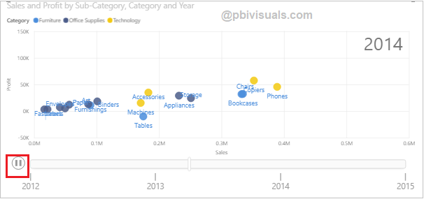
Data Storytelling with Power BI Scatter Chart
You can create a storytelling data with Scatter chart to using Play Axis feature of chart. Drag Year from Order Date column and click to play icon.

Refer more Power BI visuals- Power BI Visuals
Hope you enjoyed the post. Your valuable feedback, question, or comments about this post are always welcome.
![]()