A 100% stacked column chart is used to display relative percentage of multiple data series in Stacked columns, where the total (cumulative) of each Stacked columns always equals 100%.
In a 100% Stacked column chart, Axis is represented on X-axis and Value on Y-axis.
Refer similar chart: Stacked Column Chart
Let’s get started-
Download Sample dataset- Global_superstore_2016.xls
Follow these steps in order to create a 100% Stacked column chart:
Step-1: Load Orders dataset from Global superstore file.
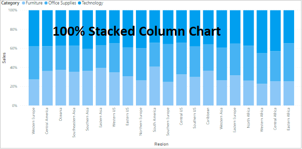
Step-2: Open Power BI file and drag 100% Stacked column Chart visual into Power BI Report page.
Step-3: Now drag columns to Fields section, see below screen shot-
- Axis: ‘Region’
- Legend: ‘Category’
- Value: ‘Sales’

Required Fields descriptions:
- Axis: Specify the Column that represent the Vertical Bars.
- Legend: Specify the Column to divide the Vertical Bars.
- Values: Any Numeric value such as Sales amount, Total Sales etc.
Format the 100% Stacked Column Chart:
You can set the font size, font family, Title name, X axis, Y axis & Data labels colors for chart visual.
Click any where on chart then go to Format Section & set below properties-
- General: Allows you to set X axis & Y axis, width & height of chart.
- Legend: Set the font size, font-family, color & position of legend on chart.
- Data colors: Here you can change the colors used for each series in the chart.
- Y-Axis: Using this section allows you to modify the appearance of the Y-Axis section of this chart.
- X-Axis: Using this section allows you to modify the appearance of the X-Axis section of this chart.
- Data labels: Its enable the values for each category on chart & you can set the display unit, position & orientation of labels.
- Zoom Slider: It enables zoom feature on chart, using this you can easily saw the small values on chart.
- Title: Specified the Title name for Chart.

Implement Small multiples feature- Small multiples chart
Refer more Power BI visuals- Power BI Visuals
Hope you enjoyed the post. Your valuable feedback, question, or comments about this post are always welcome.
![]()