
Power BI Line charts is used to display change or trends over a period of time. A combination of two or more than two lines can be used to compare trends over time.
Implement Small multiples feature- Small multiples chart
Let’s get started-
Download the sample Dataset from below link-
Following these steps in order to create a Line charts-
Step-1: Import Orders dataset from Global superstore file.
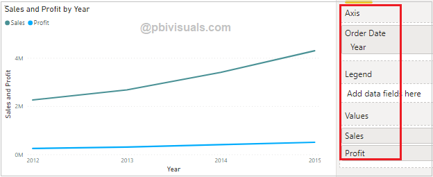
Step-2: Add Line charts into Power BI canvas and drag below columns-
Axis: Drag Year column
Values: Sales & Profit
Formatting Line charts
You can set the font size, font family, color for charts. Now click any where on chart then go to Format Section & set below properties-
General: Allows you to set X axis, Y axis, width & height of Bar chart.
Data colors: Using this section you can change the colors used for each series in the chart & customize the all line color individually.
X-Axis: Set the font size, font family, color, display units, title & grid lines for x-axis.
Y-Axis: Set the font size, font family, color, display units, line style, title & grid lines for y-axis.
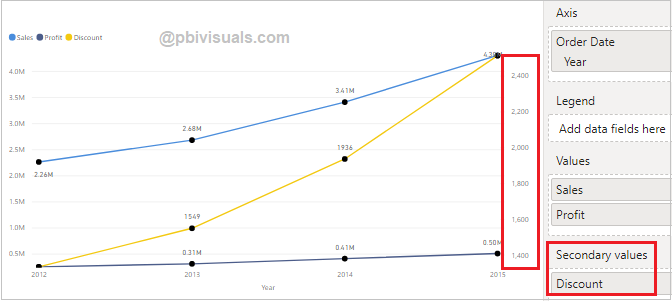
Secondary Y-axis: Set the font size, font family, color, display units & title for secondary y-axis.
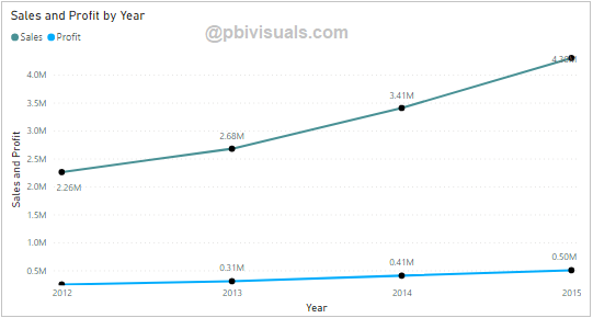
Data labels: Its enable values on Line chart.
Title: Specified the Title name for Line chart.
Shapes: You can enable markers on Line & customize the marker shapes for all lines individually.
Zoom Slider: Enables zoom feature on chart, using this you can easily saw the small values on chart.
Line charts with Secondary Y axis-
Secondary Y-axis is used to display small values on line chart, Go to format section > Enable secondary Y-axis.
Refer more Power BI visuals- Power BI Visuals
Hope you enjoyed the post. Your valuable feedback, question, or comments about this post are always welcome.
![]()