
The Table Heatmap visual is a great way to compare data easily and intuitively using colors in a table. You can create a Table Heatmap in Power BI by using conditional formatting on Matrix visual.
Let’s get started-
Download the sample Dataset from below link-
Following these steps to create a table heatmap-
Step-1: Import Orders dataset from Global superstore file.
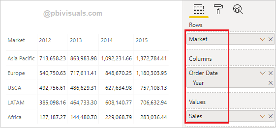
Step-2: Add Matrix visual into Power BI report canvas, and drag below columns-
Rows: Market, Columns: Year, Values: Sales
Step-3: Select Matrix visual > Go to Format section and follow these steps-
- Style: Select None.
- Grid: Turned on Horizontal & Vertical grid, and choose some light grey color for Horizontal & Vertical grid color. And give Row padding 5px.
- Increase the font size for: Column header, Row header & Values.
- Subtotals: Turned off Row Subtotals & Column subtotals.
Step-4: After that Right click on Sales column > Choose Conditional formatting > Select Background color.

Step-5: Background color dialogue box appears, now click on Diverging check box and assign colors for minimum, center & maximum values.

Step-6: Now you can see the final result-

How to hide Sales values on visual?
Follow these steps to hide values on visual –
Step-1: Right click on Sales column > choose Condition formatting > Select Font color.
Step-2: Font color dialogue box appears, now click on Diverging check box and choose same colors for minimum, center & maximum which you selected for Background color( See Step-5).
Step-3: See the final output-

Refer more Power BI visuals- Power BI Visuals
Hope you enjoyed the post. Your valuable feedback, question, or comments about this post are always welcome.
![]()