
The infographic designer custom visual helps you to present your data in form of lists, bar charts, column charts & line charts.
Infographic designer chart provides the ability to display data in form of multiples rows and columns.
It provides lots of shapes, color, icons so that you can represent information in a way that best tells the story of your data.
Also, you can import and use your personal icons in Infographic designer chart. This chart is certified by Microsoft Power BI.
Let’s get started-
Download Sample dataset- Global_superstore_2016.xls
Follow these steps to create a infographic designer chart:
Step-1: Import Orders dataset from Global superstore file.
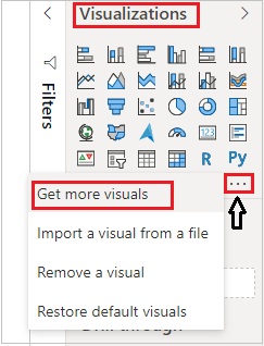
Step-2: Click on ellipsis icon under Visualization Pane > then click on Get more visuals.
Step-3: After that one dialogue box will appears, enter your Power BI account mail id & password there. If you already Logged In into Power BI desktop file then this window will not come.
Step-4: After logged In, you will see the Power BI visual pop-up window. Now follow these steps-
Under AppSource Tab > Select Category “All” > Search for “Infographic designer” > Click on Add button.

Step-5: Now add visual into Power BI report Page and drag some columns.
Basic Visualization with Infographic Designer Chart-

Display Column wise data into Infographic Designer chart-
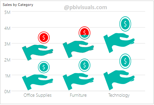
Drag “Category” column from Legend to Column by section. Now you can see in below screen shot, it split the Category data as in separate column visuals under one single visual.

Display Multi-Row wise data into Infographic Designer chart-
Use below columns in order to display multi row wise data in chart:-
Category: Drag Year column from Order Date
Measure: Sales
Row by: Category
Now you can see in below screen shot, it split the Category data as in multiple rows under one single visual. So that you can easily compare the categories with each other.

How to create a column, bar & Line chart from Infographic Designer chart-
With infographic chart you can display data as in column, bar & line chart. For this go to format section >Chart > Select Type of chart.
From here you can change the type of chart, see below screen shot.

Set Small multiples visuals property-
Using Small Multiples property you can set the font size, Min, Max height & width for small multiples visuals.

Advance customization with Infographic Designer Chart-
Step-1: You can modify the Infographic Designer Chart, just hover the mouse on chart and click on Pencil icon.
Step-2: After that click on Shape dropdown, it provides you multiples shapes category and you can choose different-different shape icon for chart visual. Also you can upload personal image icon from here to using upload button.

Step-3: Now select below properties for shape.

Step-4: See the final result.
Another Example-

In same way you can explore more features of Infographic Designer chart, Also you can upload a custom icon and create a multiple shape using first icon under Mark Designer.
Refer more Power BI visuals- Power BI Custom Visuals
Hope you enjoyed the post. Your valuable feedback, question, or comments about this post are always welcome.
![]()
I love this visual! I’m working in an international school (primary and secondary). We have plenty of homegrown data and Infographic Designer helps present the information visually to the younger kids. I wish there was a little more control over the axes however. I want to use dates and there’s no way I can see to format how they show on the x-axis.