
Tornado chart custom visual is used to compare two categories data values, where the data categories are listed vertically.
Tornado chart is certified by Microsoft Power BI.
Let’s get started-
Import below sample dataset-
| Year | Actual Sales | Target Sales |
| 2014 | 200000 | 1300000 |
| 2015 | 245000 | 1300000 |
| 2016 | 1020000 | 1000000 |
| 2017 | 1300000 | 1300000 |
| 2018 | 700000 | 1600000 |
| 2019 | 200000 | 1000000 |
| 2020 | 2600000 | 2500000 |
Follow these steps to create a Tornado chart:
Step-1: Import above mentioned dataset into Power BI.
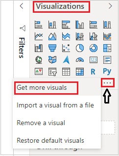
Step-2: To import visual from app source you have to Logged-In first in Power BI desktop.
After that click on ellipsis icon under Visualization Pane > then click on Get more visuals.
Step-3: After that one dialogue box appears and now follow these steps-
Under AppSource Tab > Select Category “All” > Search for “Tornado chart” > Click on Add button.
Step-4: Add Tornado chart into report page and drag some columns-

So you can see in above screen shot, chart showing comparison of Target Vs Actual year wise vertically.
Formatting of Tornado chart-
General: Allows you to set X & Y axis, width & height for visual.
Title: Specified the Title name for Chart.
X-axis: Set display scale manually for values.
Data colors: Here you can change the colors used for each series in the chart.
Data labels: Its enable the values for each labels on chart & you can set font size and color for Inside & outside fill for values.

Group: You can change color, position & text size for labels text.
Refer more Power BI visuals- Power BI Custom Visuals
Hope you enjoyed the post. Your valuable feedback, question, or comments about this post are always welcome.
![]()