
The Horizontal Bar Chart is a custom visual and it is similar like Power BI inbuilt visual clustered bar chart with some advance customization functionality.
It is useful to display comparison of multiple series as in horizontal columns. Also, this chart is certified by Microsoft Power BI.
Let’s get started-
Download Sample dataset- Global_superstore_2016.xls
Follow these steps to create a Horizontal chart:
Step-1: Import Orders dataset from Global superstore file.
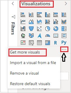
Step-2: Click on ellipsis icon under Visualization Pane > then click on Get more visuals.
Step-3: After that one dialogue box will appears, enter your Power BI account mail id & password there. If you already Logged In into Power BI desktop file then this window will not come.
Step-4: After logged In, you will see the Power BI visual pop-up window. Now follow these steps-
Under AppSource Tab > Select Category “All” > Search for “Horizontal Chart” > Click on Add button.

Step-5: Now add visual into Power BI report Page and drag some columns.
- Axis: ‘Sub-Category’
- Measure: ‘Sales’
- Overlap Values: ‘Profit’

You can see in above screen shot, chart is showing comparison of Sales & profit as in horizontal bar.
Customize the Horizontal Chart:
You can set font size, font family, Title name, X axis, Y axis & Data labels & colors for chart visual.
Click any where on chart then go to Format Section & set below properties-
General: Allows you to set X axis & Y axis, width & height of chart.
X-Axis: Using this section allows you to modify the appearance of the X-Axis section of this chart.
Y-Axis: Using this section allows you to modify the appearance of the Y-Axis section of this chart.
Title: Specified the Title name for Chart.
Font Size: Increase the font size for Values & Text on chart.
Blend(Experimental): It is inbuilt mode of text color views on chart.

Bar Labels/ Align Right/ Bar Height:
- Bar Labels allows you to change color of values text and background.
- Align Right- It will move the Bar labels in right side.
- Bar Height- Increase the height of bar.

Bar Shape: Allows you to change Bar shape, Label position and head color.

Refer more Power BI visuals- Power BI Custom Visuals
Hope you enjoyed the post. Your valuable feedback, question, or comments about this post are always welcome.
![]()