
TreeViz custom visual allows you to display hierarchical data in Tree structure form with expand or collapse levels functionality.
Let’s get started-
Download Sample dataset- Global_superstore_2016.xls
Follow these steps to create a TreeViz chart:
Step-1: Load Orders dataset into Power BI file.
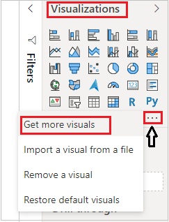
Step-2: Now logged-In into Power BI desktop file to import the custom visual from App source.
After that click on ellipsis icon under Visualization Pane > click on Get more visuals.
Step-3: After that one dialogue box appears and now follow these steps-
Under AppSource Tab > Select Category “All” > Search for “TreeViz” > Click on Add button.
Step-4: Add TreeViz visual into Report page and drag some columns-
Category Data: Category & Sub-category
Measure Data: Sales

Understand visual functionality:
Using below arrow icons you can expend/ collapse the levels on chart.
Green arrow: show/hide children
Orange arrow: hide 3 siblings
Purple arrow: – show 3 more siblings

Formatting for TreeViz Chart:
General: Allows you to set X & Y axis, width & height for visual.
Title: Specified the Title name for Chart.
TreeViz settings: Show hide measure from visual and set children limit.

Refer more Power BI visuals- Power BI Custom Visuals
Hope you enjoyed the post. Your valuable feedback, question, or comments about this post are always welcome.
![]()