
The Pulse chart shows key events on a timeline, and lets you play back the events to reveal insights.
Also, You can create a storytelling data with Pulse chart and this visual is certified by Microsoft Power BI.
Note:
- Pulse chart allows you to playback the data to see the rend unfold in front of your eyes.
- Events over a timeline can pause the animation.
Let’s get started
Import below sample dataset into Power BI desktop.
| Date | Members | Event |
| 12/01/2020 | 1000 | |
| 13/01/2020 | 2000 | Power BI Session |
| 14/01/2020 | 3000 | |
| 15/01/2020 | 500 | |
| 02/02/2020 | 500 | Azure Session |
| 03/02/2020 | 4000 | |
| 04/02/2020 | 500 | |
| 05/02/2020 | 700 | Machine Learning Session |
| 08/02/2020 | 600 | |
| 01/03/2020 | 200 | |
| 02/03/2020 | 800 | .Net Session |
Following these steps in order to create a Pulse chart-
Step-1: Load above sample dataset into Power BI Desktop.
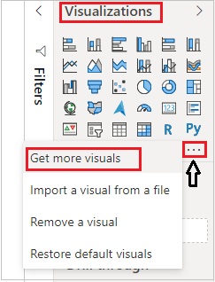
Step-2: To import visual from app source you have to Logged-In first in Power BI desktop. After that click on ellipsis icon under Visualization Pane > then click on Get more visuals.
Step-3: After that one dialogue appears. Now follow these steps-
Under AppSource Tab > Select Category “All” > Search for “Pulse chart” > Click on Add button.
Step-4: Add Pulse line chart visual into Power BI canvas and drag some columns as shown in below screenshot-
Timestamp: Add Date column.
Values: Add Members column.
Event Title: Add Event column.
Event Description: Add Event Description column.

Formatting Pulse chart visual-
General: Allows you to set X & Y axis, width & height for visual.
X-Axis: Using this section allows you to modify the appearance of the X-Axis section of this chart.
Y-Axis: Using this section allows you to modify the appearance of the Y-Axis section of this chart.
Series: Set width and color for Line.
Gaps: You can see the Gaps in Line chart, if there is no data.
Popup: Manage Popup width, height, Text, color etc.
Dots: Set dot color and size.
Playback: Mange Animation functionalities like Autoplay, repeat, Speed, Pause & Delay.
Runner: Set the name while the chart animates.
Title: Specified the Title name for Chart.

Refer more Power BI visuals- Power BI Custom Visuals
Hope you enjoyed the post. Your valuable feedback, question, or comments about this post are always welcome.
![]()