
The Hierarchy Chart is used to displays hierarchical data in a tree format such as organization and family trees. This is custom visual and certified by Microsoft Power BI.
Import below sample dataset for example-
| Id | Dept | Emp Name | Parent Id |
| 1 | Manager | Sandeep Raturi | |
| 2 | Team Lead | Paul | 1 |
| 3 | Team Lead | Aria Cruz | 1 |
| 4 | Team Lead | Dinesh Raturi | 1 |
| 5 | Developer | Matt | 4 |
| 6 | Developer | Pradeep | 4 |
| 7 | Developer | Jacobs | 2 |
| 8 | Developer | John | 3 |
Follow these steps in order to create a Hierarchy Chart:
Step-1: Import above dataset into Power BI file.
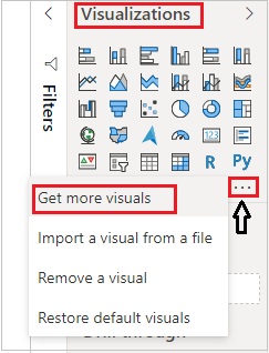
Step-2: To import visual from app source you have to Logged-In first in Power BI desktop.
After that click on ellipsis icon under Visualization Pane > then click on Get more visuals.
Step-3: After that one dialogue box appears and now follow these steps-
Under AppSource Tab > Select Category “All” > Search for “Hierarchy Chart by Akvelon” > click on Add button.
Step-4: Add Hierarchy chart visual into report page and drag some columns-

Formatting the Hierarchy Chart visual-
Select the visual and go to the format pane & follow these properties-
General: Allows you to set X axis, Y axis, width & height for chart.
Levels: Here, you can mange the controls(+ , –) for chart and can set the depth control for chart.

Types Colors: Change the colors for hierarchy levels.

Nodes: Set the height, width, color, font size for levels, also you can change the shape of hierarchy.

Legend: Set the Title, Font color, Text size & Position for legend.
Links: Change the link colors of nodes.
Collapse & Expend the Hierarchy Levels
You can collapse & expend the levels of Hierarchy to click on + & – Icon.

Refer more Power BI visuals- Power BI Custom Visuals
Hope you enjoyed the post. Your valuable feedback, question, or comments about this post are always welcome.
![]()