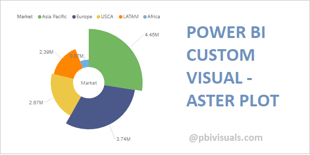
The Aster Plot is a twist on a standard donut chart, and this visual is certified by Microsoft Power BI.
It allows a category that drives the chart and up to 2 measures:
- The first measure controls the depth of each section
- The second measure controls the width of each section
Let’s get started-
Download Sample dataset- Global_superstore_2016.xls
Follow these steps to create a Multi KPI:
Step-1: Import Orders dataset from Global superstore file.
Step-2: To import visual from app source you have to Logged-In first in Power BI desktop.
After load data into Power BI file, check the datatype for order date column, if datatype is not in date format then change it as in date.
After that click on ellipsis icon under Visualization Pane > then click on Get more visuals.
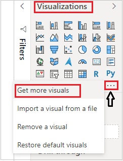
Step-3: After that one dialogue box appears and now follow these steps-
Under AppSource Tab > Select Category “All” > Search for “Aster Plot” > Click on Add button.

Step-4: Add Aster Plot visual into Report page and drag some columns-
Category: Market
Y Axis: Sales & Profit

Formatting Aster Plot visual-
General: Allows you to set horizontal & vertical position, width & height for visual.
Legend: Set the font size, font-family, color & position of legend on chart.
Title: Specified the Title name for Chart.
Center Label: It enables category name on center of chart and you can set color and font size for this.
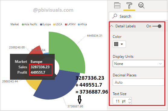
Details Labels: It enables the data values for each slicer, and you can adjust color, size & display unit for values.
Pies color & Outer line: You can change the Pie colors for each & outer line enables the black circle border around the Aster plot and you can change the color & thickness of border.

Refer more Power BI visuals- Power BI Custom Visuals
Hope you enjoyed the post. Your valuable feedback, question, or comments about this post are always welcome.
![]()
This is a useful chart, but it would be great if there were a way of setting the range on the thickness of the ring – as if the thickness were an axis. As it is currently, the chart rescales when I switch between different datasets or filter my data so the thickest segment will also be the same thickness regardless of the actual value. If I were able to set the upper range on the thickness I would be able to compare two datasets.
(Note, this page currently says that the General formatting allows you to set the X and Y axis – I think this is a mistake, it means X and Y position)